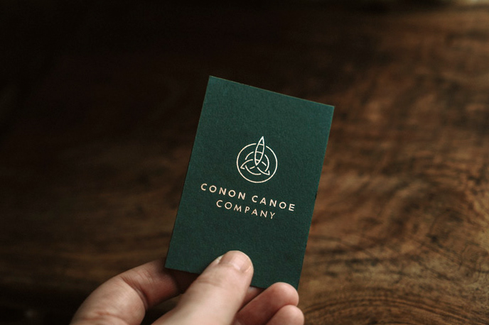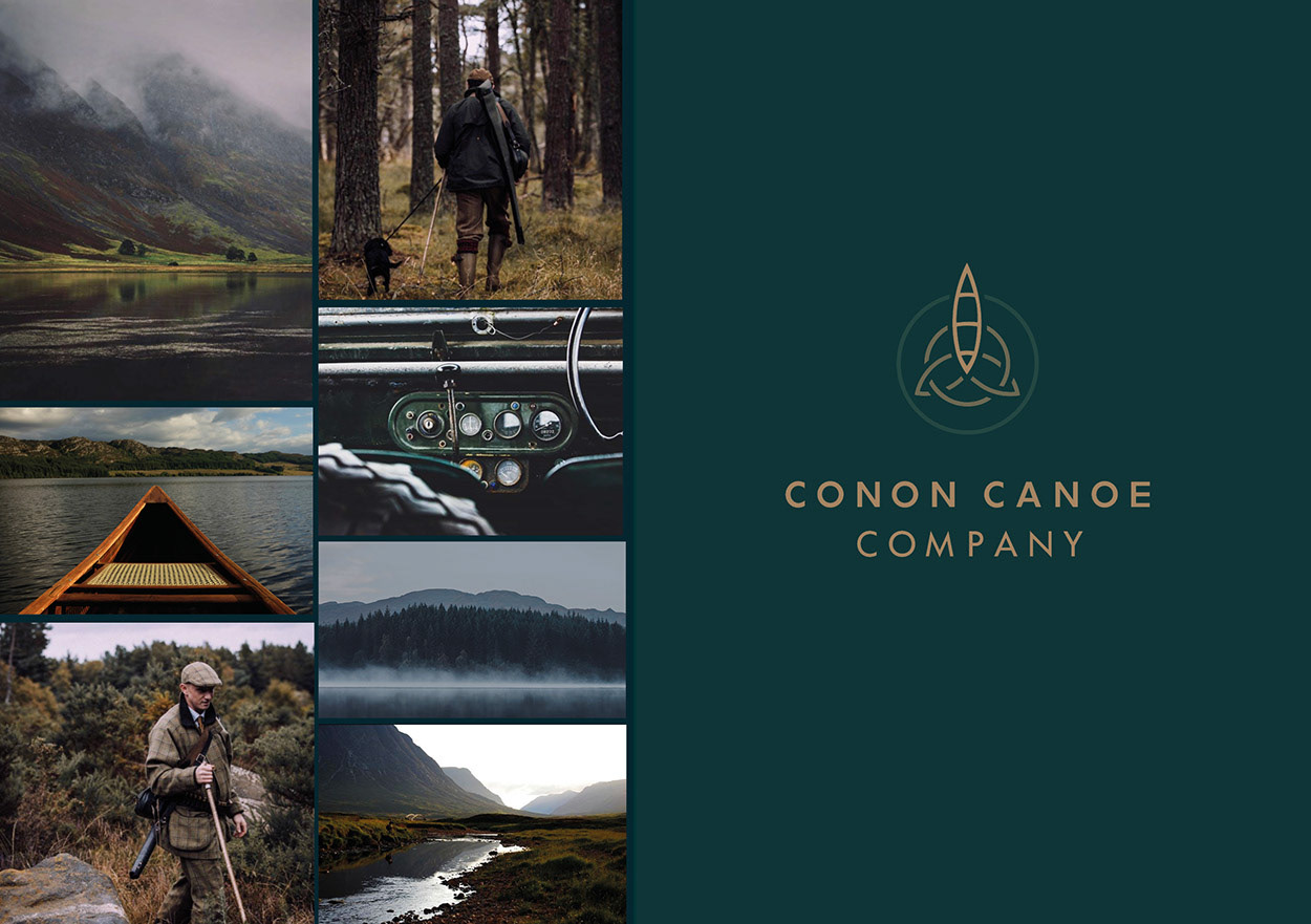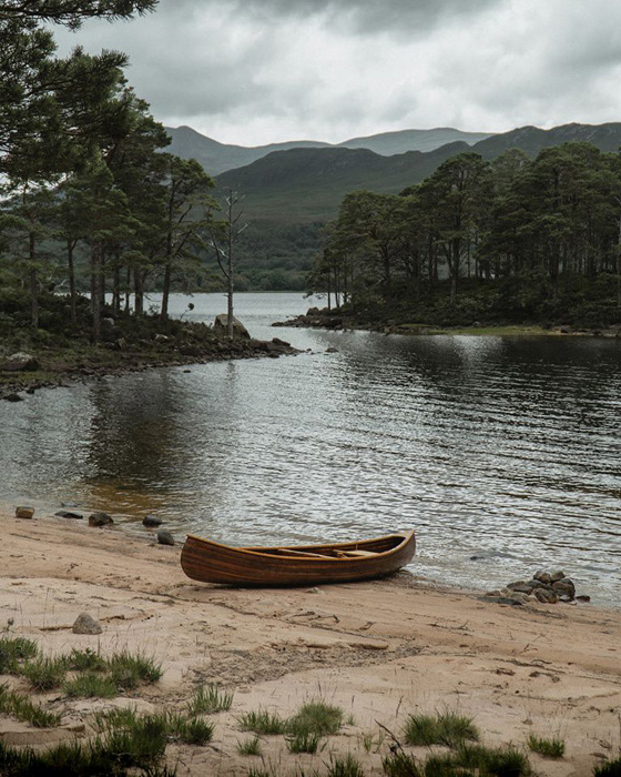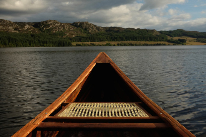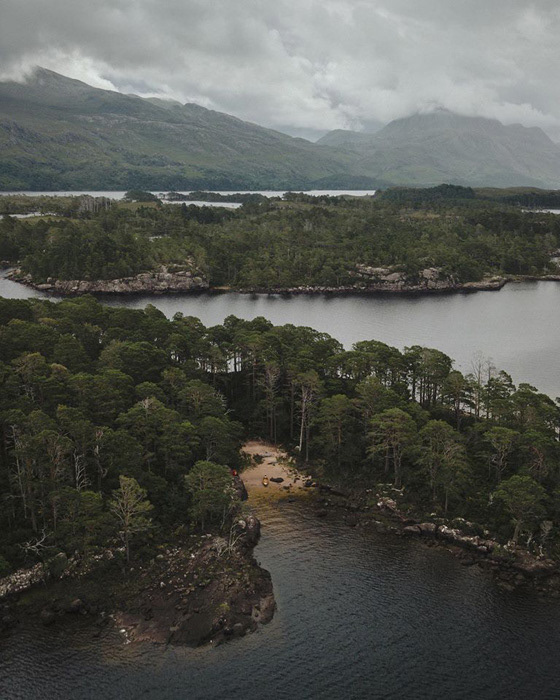
The Conon Canoe Company asked for a logo that was classic, evoking solidity and dependability. Based on the Brahan Estate in the Scottish Highlands, the client wanted to evoke a sense of Scottishness about their brand through the use of the celtic triquetra.
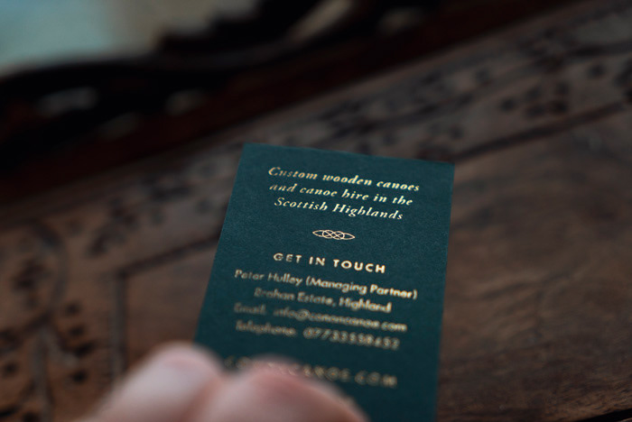
With a customer base concerned with quality and longevity, it was very important that these values came across in all customer-facing imagery and typeface.
In the design process, the main challenge lay in finding the balance of Celtic elegance without becoming twee, and merging this with a simple canoe shape to create a unique and timeless brand.
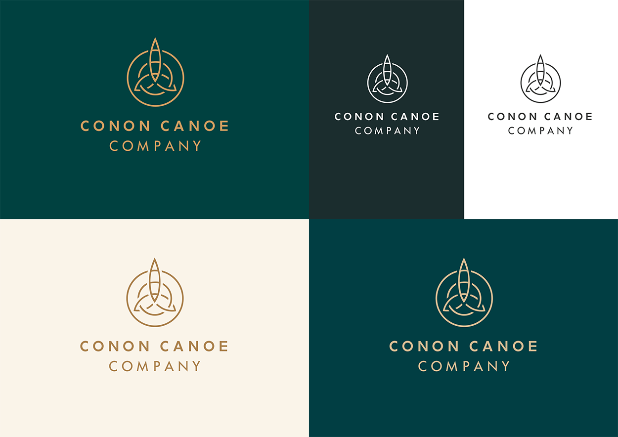
The end result evokes a true sense of timelessness and dependability with an air of Scottish elegance. The logo is also designed to be flexible and adjustable, enabling it to fit comfortably within a contemporary context and is simple enough to be carved, stamped and printed in all sizes.
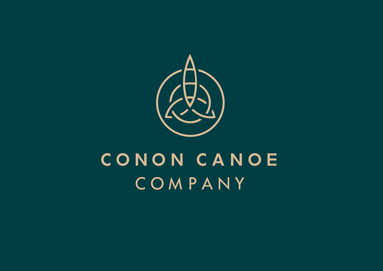
The logo, based on the Celtic triquetra, has been carefully designed to depict a canoe sailing through water.